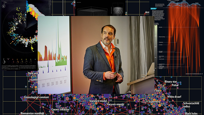
The McCandless Method: The Art and Science of Data Presentation

Data visualization is a crucial aspect of data analysis and decision-making. However, creating effective visualizations that are both aesthetically pleasing and informative can be a challenge. The McCandless Method, named after information designer David McCandless, is a technique that combines the art and science of data presentation to create clear, engaging, and impactful visualizations.
What is The McCandless Method?
The McCandless Method is a technique that combines the principles of design and data visualization to create clear, engaging, and impactful visualizations. It emphasizes the use of simple shapes, colours, and typography to convey information in an easy-to-understand manner. The method also encourages the use of storytelling to make data more relatable and memorable.
The McCandless Method consists of five key principles:
- Simplicity: Use simple shapes, colours, and typography to create clean and uncluttered visualizations.
- Clarity: Make sure that the data being presented is easy to understand and interpret.
- Emphasis: Use colours, typography, and other design elements to draw attention to the most important information.
- Hierarchy: Use different design elements to create a hierarchy of information, with the most important information being the most prominent.
- Storytelling: Use data to tell a story and make it more relatable and memorable.
Why Use The McCandless Method?
The McCandless Method is a powerful technique for creating effective data visualizations. It provides a structure for combining the art and science of data presentation to create visualizations that are both aesthetically pleasing and informative. This makes it easier for audiences to understand and remember the data, leading to more effective decision-making.
Additionally, the McCandless Method has been proven to be a great approach to making data more relatable, as it uses storytelling to connect the audience with the information, making it more interesting and memorable.
How to Implement The McCandless Method
To implement the McCandless Method, start by identifying the key message that you want to convey with your visualization. Then, use the five key principles of the method to create a clear, engaging, and impactful visualization.
- Simplicity: Use simple shapes, colours, and typography to create clean and uncluttered visualizations.
- Clarity: Make sure that the data being presented is easy to understand and interpret.
- Emphasis: Use colours, typography, and other design elements to draw attention to the most important information.
- Hierarchy: Use different design elements to create a hierarchy of information, with the most important information being the most prominent.
- Storytelling: Use data to tell a story and make it more relatable and memorable.
Conclusion
Data visualization is a crucial aspect of data analysis and decision-making. The McCandless Method, named after information designer David McCandless, provides a structure for combining the art and science of data presentation to create visualizations that are both aesthetically pleasing and informative. By following the five key principles of the method, you can create clear, engaging, and impactful visualizations that will help you make better decisions.
